
Or How to Create Bespoke Conversion Rates
Last week, GDS released a new feature called chart-specific calculated fields.
I decided to write a quick post to describe this as the documentation is pretty scarce…
The main interest of this feature is that it works with blended data sources. Even if you can’t create a calculated field at the data source level, this is pretty useful to for instance create conversion rates metrics of user or session-based segment XYZ versus all users or sessions.
Thus you can get conversion rates for anything, without having to create a goal in Google Analytics. For instance, you can see
– what’s the % of total sessions with event XYZ
– what’s the % of total sessions with view of page XYZ
– etc.
So here is how to create this from a Google Analytics data source:
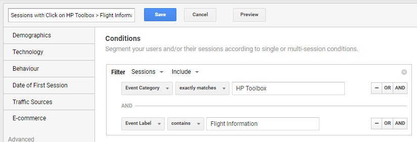
1. Create your segment in GA
For instance, Sessions that include a specific event (below a click to Flight Information – that’s from an airline site)
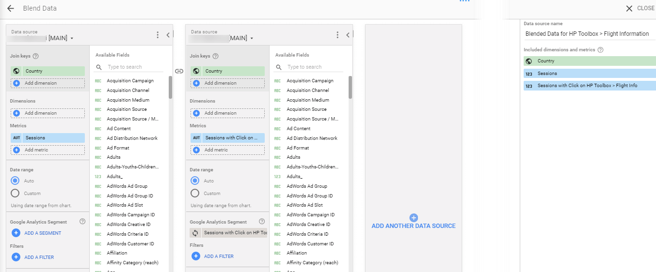
2. Create the blended data source
Below, I’ve blended a GA view with the same view but applying the newly created segment.
I’ve added the Sessions metric for both of them but renamed the sessions looking at the specific segment to avoid any confusion later on.
I’ve also added the Country dimension as a joint key, but this is optional.
So you should end up with at least 2 metrics in your blended data source; All Sessions and Sessions from Sessions including event XYZ:
Note that the data source without segment must be the first one (in the left) as it will take precedence over the data source using segment in the right. This is critical when/if using join key(s).
3. Create a new component (chart)
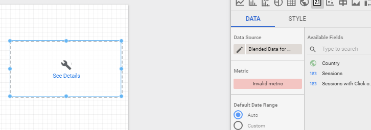
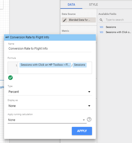
4. Create the calculated metric
Click to select a metric, then CREATE FIELD:
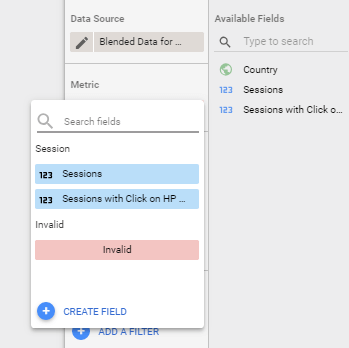
Type the name of your new calculated metric and enter your function, then select the Type (Percent below as we are looking at a conversion rate):
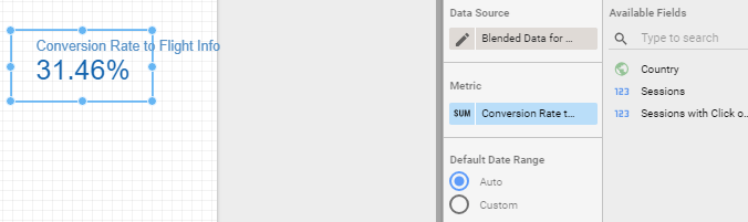
And voila!
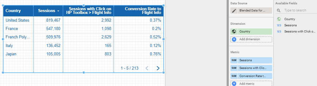
5. Copy to re-use
The calculated field is specific to the chart but you can just copy-paste the initial chart to avoid having to create the calculated metric again.
Note: When using a table, don’t enable the “summary row” as it will sum up the conversion rates… (I believe this is one of the limitation of having the calculated metric defined at the component level and not at the blended data source one).
Hope this is helpful and let us know how you use this new chart-specific calculated fields 🙂