A few days ago we featured the post-purchase customer experience of sports equipment sites. Today, we’ll be exploring five online shoe ecommerce sites that were included in the Online Shoe Checkout Usability Report.
Let’s dive in!
The Analysed Ecommerce Sites From the Report
- Ecco – www.eccoshoes.co.nz
- Number One Shoes – www.numberoneshoes.co.nz
- Hannahs – www.hannahs.co.nz
- Merchant 1948 – www.merchant1948.co.nz
- Shoe Connection – www.shoeconnection.co.nz
Know more about the Online Shoe Checkout Usability Report here.
The Good, The Bad and The Ugly
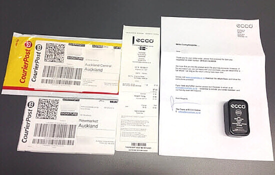
1. Ecco
|
The Good
|
Received order confirmation email shortly after checking out |
| Order confirmation email included the customer service information and refund information | |
| Offer free shipping | |
| Item was delivered after 2 business days which was within their specified estimated delivery time of 5-10 business days | |
| Included the receipt and return postage label inside the package | |
| Name of the company was on the package (sticker) | |
| Included a thank you note signed by the Ecco Online team | |
|
The Bad
|
No shipping confirmation email received |
| No return form inside the package (you’d have to download it from their website) | |
|
and The Ugly
|
Order confirmation email had no brand personality or tone of voice and only had the company logo |
| Order confirmation email didn’t include upsells, special discounts, social media account links or surveys/ customer feedback | |
| No branding on the package |
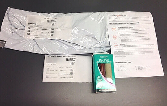
2. Number One Shoes
|
The Good
|
Received an order confirmation shortly after checking out |
| Order confirmation email layout reflected their brand personality and had links to their social media accounts, customer service information and navigation links back to their website | |
| Order confirmation email also included their unique value proposition – free delivery, free 365 day return and click & collect | |
| Shipping confirmation email was received on the same day the item was ordered which contained tracking information.The email had no company branding and just had the company logo which did not display properly on the email. The copy used was also very plain and generic. | |
| Delivered the item the day after the order date | |
| Included the return postage label inside the package | |
| A thank you note, customer service information, invoice, return and exchange information were included inside the package | |
|
The Bad
|
No indication of estimated arrival date in the order confirmation email |
| The shipping confirmation email had no company branding and just had the company logo which did not display properly on the email. The copy used was also very plain and generic. | |
| No name of the company on the package | |
| The package was oversized for the small item inside. They used a very big white plastic bag which was not easy to open. | |
|
and The Ugly
|
Confirmation emails didn’t include product recommendations, special discounts or surveys/ customer feedback |
| No branding on the package |
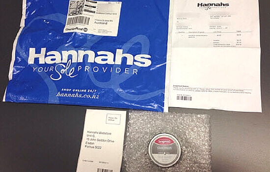
3. Hannahs
|
The Good
|
Order confirmation email was received shortly after checking out. They used email personalisation and included the customer’s name in the subject line |
| Order confirmation email layout reflected their brand personality and had links to their Facebook account, customer service, delivery and return information as well as navigation links back to their website | |
| Shipping confirmation email was received after 2 business days which included tracking information and the estimated arrival date | |
| Copy used in the confirmation emails was more personal instead of the usual generic spiels in most confirmation emails | |
| Delivered the item 3 business days from the order date which is within their estimated arrival date range | |
| Used company branding on the packaging | |
| Included the return postage label inside the package | |
| Included the thank you note, customer service information, invoice, return and exchange information inside the package | |
| The Bad | None |
| and The Ugly | Confirmation emails did not include customer survey/ feedback |
4. Merchant 1948
|
The Good
|
Order confirmation email received shortly after checking out |
| Order confirmation email layout reflected their brand personality and had a quality image of their products on models. Included in the email was their value proposition of free shipping on orders over $50, navigation links back to their site, links to their social media accounts, customer service information and other product recommendations. They suggested items subtly by titling the section “You might like these…” | |
| Shipping confirmation email was received on the same day the order was made. The email reflected the brand personality and had some of the information from the order confirmation email in there. They included the tracking and return information as well as links to their return policy | |
| Delivered the item 2 business days after order date which was within their estimated arrival date range | |
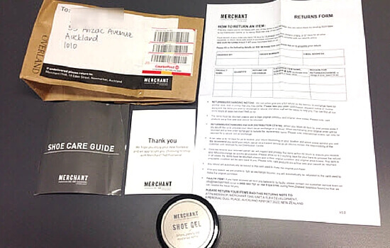
| Used company branding on the packaging | |
| Included a separate thank you card with their customer service information | |
| Included the return information and form inside the package | |
| Included a shoe care guide inside the package (Nice! 🙂 ) | |
| The Bad | None |
| and The Ugly | Confirmation emails did not include customer survey/ feedback |
5. Shoe Connection
|
The Good
|
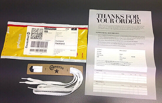
Delivered item after 2 business days which was within their estimated arrival date range |
| Name of the company was on the package (sticker) | |
| Included the thank you note, invoice, return and exchange information inside the package | |
|
The Bad
|
No order confirmation email received |
| No shipping confirmation email received | |
| No customer service information on the form inside the package | |
| and The Ugly | No company branding on the package |
Channel the post-purchase good vibes to your customers
The online shoe sites did a better job in delivering good post-purchase experience to their customers compared to the sports equipment sites. Below is a quick snapshot of the good things they did as well as the bad and the ugly things that they need to improve on.
The Good Stuff
They included the return postage label in the package.
As mentioned in the previous post, including a return form in the package doesn’t mean that you’re encouraging your customers to return the item. According to comScore’s survey, 82% of customers say they would complete the purchase if they could return the item to a store, and 66% said they review an online retailer’s return policy before making a purchase. Again, it’s all about making it easy for your customers and including a return label in the package helps with that.
A signed thank you note was included in the package.
One sure way to set you apart from your competitors is to have a signed thank you note inside the package. This inexpensive and simple way of personalising a package insert will be seen by your customers as a sincere gesture from your part and can help build loyalty to your brand. Appreciating your customers and the business they give you can go a long way in providing a memorable post-purchase experience for them.
The confirmation emails showcased their brand personality and included useful information, links to social media accounts and navigation links back to the site.
A good way to further engage your customers after they purchase from you is to extend your overall brand experience to your confirmation emails. Use a more personalised copy instead of generic and standard spiels. You can also include quality and inspirational images in your emails that further show off your brand to your customers.
Additionally, keep them engaged and interested by providing navigation links to go back to your site without being too pushy (such as using a CTA that tells them to go back to your site to buy again). This type of hard-sell right after a purchase may turn off your customers and harm your credibility. Merchant 1948 added a ‘You might like these…” recommendation section to its confirmation email that subtly lays the groundwork for the customer’s next purchase.
You can also leverage the power of social media and encourage your customers to follow you and keep in touch with through your social channels.
These are good ways to connect more with your customers as customers today don’t just buy products but also buy the customer experience delivered by the product.
Email subject line personalisation was used for the confirmation emails.
You know that the confirmation emails you send will be opened regardless of what subject line you use as your customers are expecting to receive information on their online purchase. But that doesn’t mean that you should just give them generic confirmation emails with their order numbers in the subject lines.
When you recognise your customer by name in the subject line of the email, you are able to establish an immediate and personal connection with that customer. This keeps their experience with your brand dynamic and personally relevant. I’m sure it won’t be that difficult to include another word (your customer’s name) in the email subject line which can make an impact on how they perceive your brand.
They used company branding on the package.
Unlike physical retail stores, ecommerce businesses or online retailers have less ways to connect with customers on a more personal level. It is important then to leverage every customer touch point to impress customers and create a positive and memorable experience.
You can do that through customer experience focused packaging. There are many ways by which you can impress your customers through branded packaging. Simple ways include using your company’s own product or store packaging instead of the shipping company’s standard mailing bags or boxes. This was done by Hannahs and Merchant 1948 and they stood out compared to the other online shoe retailers who delivered items using the shipping company’s mailing bags.
You can also go the extra mile and exceed your customer expectations with well-designed, custom branded packaging. Check out some good recommendation on how you can achieve that in this post.
Used package inserts to add more value to the purchased item.
Merchant 1948 included a shoe guide together with the purchased shoe gel in the package. This is a good use of the right packaging insert as it is related to the purchased item and guides the customer on how best to care for shoes which was the intention of purchasing the shoe gel in the first place.
Using the right package inserts is a good way to make your customers feel valued without them feeling that you are pushing them to buy from you again (at least not right away).
The Bad and The Ugly Stuff
We’ve found that for the online shoe sites we evaluated, there were bad and ugly practices that were similar to the ones from the sports equipment ecommerce sites. For the following insights, we’ll highlight those which we found unique to the online shoe sites listed above.
No indication of estimated arrival date in the confirmation emails.
Surely you don’t want to make your customers go through the trouble of going back to your site, scrolling down to the footer, clicking on the shipping link, reading through your delivery information and calculating the estimated arrival date of their purchased item. That’s just not a good way to thank them for the business they gave you.
Make sure you include useful information for your customers in the confirmation emails to avoid creating anxiety and the need to contact your customer support because they can easily access the information they need from your emails.
Used an oversized package for the item.
As part of creating a branded packaging experience for your customers, choosing the right packaging size is an important part of the whole experience. Use the right size of packaging for the items for two purposes – 1) to give the item inside enough protection and 2) to make it easy for your customers to get the item from the package.
Number One Shoes had a huge plastic bag for the small item inside. The bag was also difficult to open and obviously I had to dig deep for the item once I got the bag opened.
Think of it this way, you can also save on packaging costs from eating away your profit margin as shipping companies charge based on size and weight.
No customer service information inside the package.
It is important to show your customers that you’re ready to provide information or assistance in case they need them. You can do this my making sure your customer service information is readily accessible across all customer touch points. Including the customer service information inside the package can save your customers the trouble of looking through the confirmation emails you sent or going back to your site just to get your contact details.
No customer survey or feedback.
Asking your customers about their shopping experience shows that you care and want to constantly provide them the best experience when it comes to your brand and your products. You can encourage your customers to participate in your surveys by offering them incentives such as a chance to win something, special discounts or early access to latest product releases.
Asking for feedback is one thing, and acting on those valuable inputs is another. Make sure that you take those customer inputs into consideration in improving your overall customer experience.
Pay attention to the little details. See what happens.
You’d be surprised how little things that show customers you value them can impact your customer engagement rates and inevitably, your return on investment (ROI).
So, if you want to start creating awesome experiences for your customers that they are more than happy to share with others, contact us and we’ll help you develop and implement a plan of action tailored to your customers’ and business’ specific needs. Quickly fill out the form at the bottom of this page and someone from our team will contact you.

