I love music. Plain and simple.
So when I heard about Tidal through social media, I couldn’t help but be intrigued. The hashtag “#TidalforAll” was trending due to artists such as Alicia Keys, Nicki Minaj & Kanye West all using their official Twitter accounts to promote the musical platform.
But what was it? Was it simply another musical platform and if so, what reason have I got to switch from my beloved Spotify Premium?
So I decided to type “tidal.com” into my address bar and the below screen was returned.
Needless to say, this absolutely confused me. What was this cassette with “Jay-Z: B-Sides” on it? Did I stumble onto a Jay-Z sales page by accident? The headline “Closer than Front Row; Better than Backstage” – was this referring to exactly? How did this relate to what Tidal was? Oh – and the call to action button with “Try Tidal Now”. What in the world is Tidal???
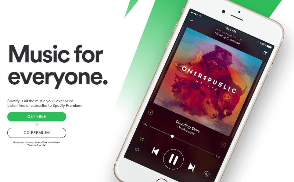
For a point of comparison, I kept that frame of mind and applied it to Spotify. So I went to “spotify.com” and pretended I didn’t know much about it.
It wasn’t much of a surprise that the Spotify Homepage was a much better experience.
In less than 15 seconds, I knew that:
– Spotify was a music service (the “What”)
– I could access Spotify on my mobile devices via a dedicated app (the “How”) – so I assumed it was streaming service (related to the “What”)
– There is a Free version so no risk to me to try it out (the “Why”)
Brilliant, I thought. In 15 seconds, I was able to clearly understand what it was, how I could consume it and why I should use their product. Plus their “Free version” simply made it a no-brainer for me as a consumer.
Unfortunately, Tidal isn’t the only website out there where a Homepage is designed to inform the user and motivate them to continue their journey through the site with hopes of converting them into a sale, a lead or any other desirable commercial outcome.
It’s critical to:
– Ensure you put the consumer’s needs first and design your website accordingly.
What message do you want to communicate to your potential customers? What is your unique selling proposition? Is this communicated clearly on your website?
– Emphasise your point of differentiation. If you’re in business, chances are you have competition – who also have a website. Assume that your potential customers have visited your competitor’s website and give them clear reasons why they should chose your product or service instead.
– As a business owner, understand how your site is performing – and identify areas where you can make improvements. A free tools such as Google Analytics is a great way to collect qualitative data and allow monitoring & analysis, steps essential in making your website work harder
– Have your website mobile / tablet friendly (it’s surprising how many are not) and this doesn’t simply mean having a responsive or m-dot site. Look at it through the user’s eyes – can I easily navigate the site? Is it well-laid out with clear images & text?
– Test areas of your website that is under-performing through A/B testing. Use qualitative data to inform you to where & what to test. Then use Optimizely or Visual Website Optimiser to create ‘variations’ and test them against the incumbent page to see which converts the best. Often, simple tests such as button text or button colour changes can yield some significant results.
Editor’s note: As of 1 May, the Tidal homepage has changed from when this article was originally written.


