Creating a new responsive website for Allianz.
CLIENT: Allianz Insurance Australia | PROJECT: Responsive website strategy, design and development
First worked with the Allianz team to conduct research into customer behaviour formulating a strategy for the creation of a new online experience. The creative and development project encompassed all site content along with integration with the rating engines and customer management systems.
Understanding customer journeys
How do buyers learn about insurance products? What steps do they take to requesting a quote? How can Allianz meet the needs of diverse audience segments from the one website? What are the competitors doing?
Quantitative and qualitative data were gathered and analysed to understand what was and was not working on the existing site. Alternate site structures were created, tested, adjusted, and tested again. Navigation hurdles were eradicated, inconsistencies were ironed out and positive scenarios adopted.
The result – a simplified user journey that conveys the essential information required and valued by customers.
Framing the user experience
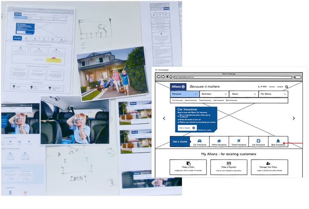
Extensive wireframe work was carried out. Alternatives were modelled. Desktop and mobile devices were included, as well as the need to be able to convert the design to both design and code. Stakeholder feedback was taken and wireframes adjusted. Detailed refinement of wireframes was undertaken and further feedback incorporated.

Prototyping solutions
Advanced wireframes were converted to a functional prototype with completely new content. Alternate functionality was created for contentious elements. Users were tested on the prototype and the results used to select the best site solution.

Translating the experience responsively
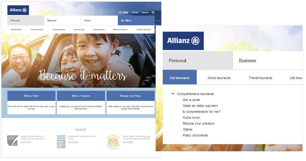
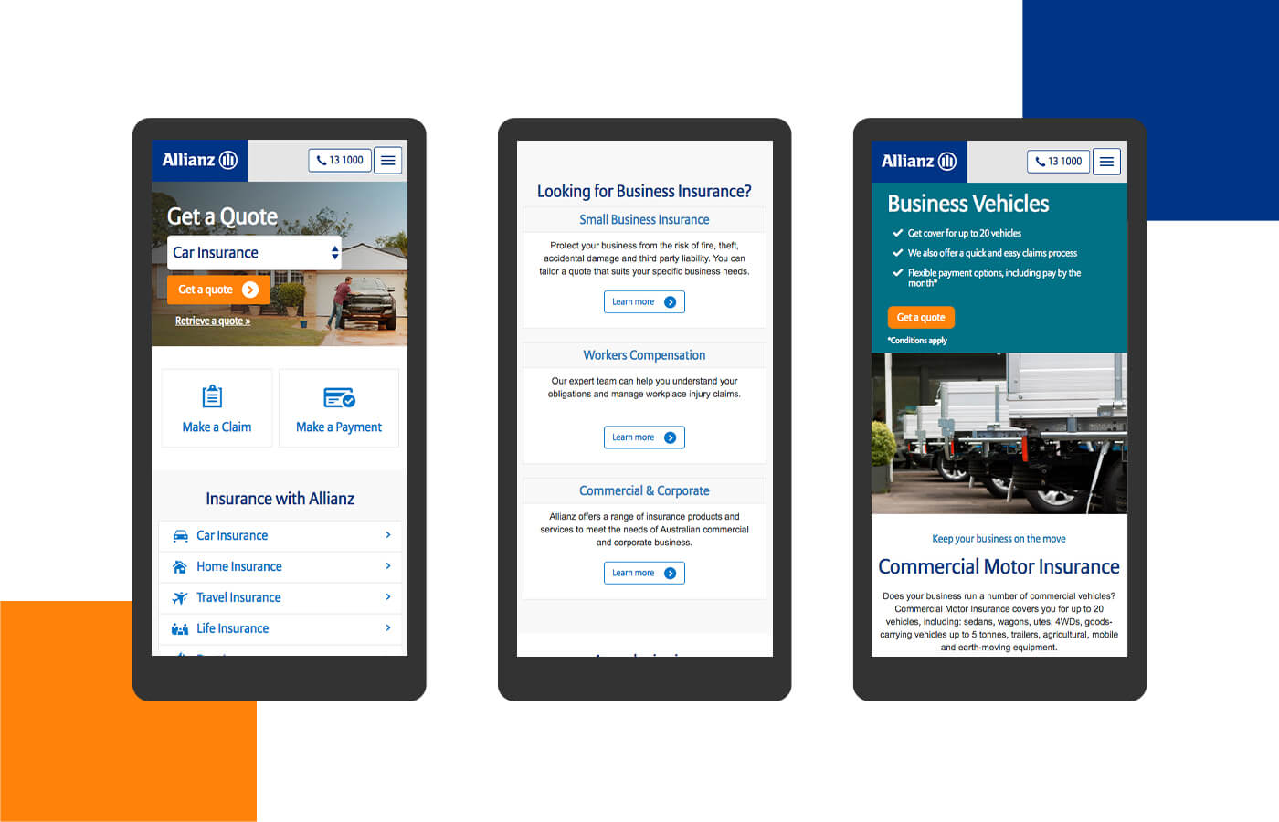
Components, functionality and content from previous steps allowed the design team to focus on visual alternatives. Assumptions made through the user experience process were challenged, with decisions reinforced and alternatives sought. Design preferences were identified and refined. Additional pages and unique components were added to the designs with feedback received in earlier iterations included. The result – a powerful, crisp, fully responsive design that delivers on user’s needs.

